


Matplotlib is a powerful and versatile data visualization library in Python. It is used to create a wide range of static, animated, and interactive plots and charts.
In this article we will explore some data analysis with graphical chart with the help of matplotlib.
PermalinkKnowledege Required
Jupyter Notebook
Python
Pandas
Numpy
Matplotlib
PermalinkData Source
- Fifa 2018 Football Data from Kaggle to perform this analysis. The data has 18207 rows of data and 89 columns:
['Unnamed: 0', 'ID', 'Name', 'Age', 'Photo', 'Nationality', 'Flag', 'Overall', 'Potential', 'Club', 'Club Logo', 'Value', 'Wage', 'Special', 'Preferred Foot', 'International Reputation', 'Weak Foot','Skill Moves', 'Work Rate', 'Body Type', 'Real Face', 'Position', 'Jersey Number', 'Joined', 'Loaned From', 'Contract Valid Until', 'Height', 'Weight', 'LS', 'ST', 'RS', 'LW', 'LF', 'CF', 'RF', 'RW', 'LAM', 'CAM', 'RAM', 'LM', 'LCM', 'CM', 'RCM', 'RM', 'LWB', 'LDM','CDM', 'RDM', 'RWB', 'LB', 'LCB', 'CB', 'RCB', 'RB', 'Crossing', 'Finishing', 'HeadingAccuracy', 'ShortPassing', 'Volleys', 'Dribbling', 'Curve', 'FKAccuracy', 'LongPassing', 'BallControl', 'Acceleration', 'SprintSpeed', 'Agility', 'Reactions', 'Balance', 'ShotPower', 'Jumping', 'Stamina', 'Strength', 'LongShots', 'Aggression', 'Interceptions', 'Positioning', 'Vision', 'Penalties', 'Composure', 'Marking', 'StandingTackle', 'SlidingTackle', 'GKDiving', 'GKHandling', 'GKKicking', 'GKPositioning', 'GKReflexes', 'Release Clause']
PermalinkCore Objective
PermalinkFifa 2018 Data Analysis
An Histogram Chart Will be Use to See the Distribution of Player Skill in Fifa 2018.
A Simple Pie Chart will be Done to see the Percentage of Player that Preferred to Play with there Left Foot, and Player that Preferred to Play with there Right
Advance Pie Chart to Show the Weight of Fifa Player.
PermalinkHistogram
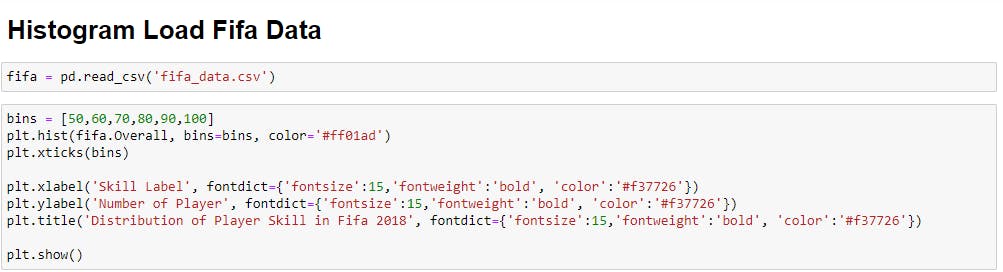
bins is use as the X axis where the skill label from 50 -100 will be display
plt.hist() is the plot syntax for histogram where the data are placed an other attribute are placed like color for the histbar
fifa.Overall Overall is a column in the fifa dataset that hold a player overall skill average
plt.xlabel() attribute contain label of X('Skill Label'), fontdict={} edit the xlabel font style,size,color,weight etc...
plt.ylabel() attribute contain label of Y('Number of Player'), fontdict={} edit the xlabel font style,size,color,weight etc...
plt.title() attribute contain the text lable for your title of your chart, with fontdict={} edit the xlabel font style,size,color,weight etc...
plt.show() Show your Chart (Histogram)
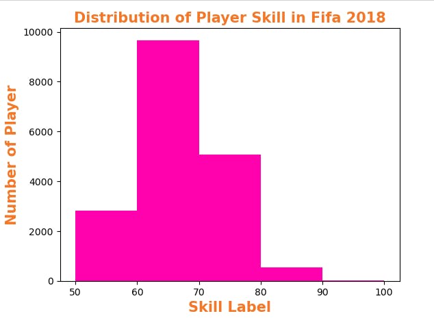
Number of Player: It indicate the amount of player with skill level from 50 - 100
Skill Label: The show the range of players from 50 - 100 that are skilled in fifa 2018
PermalinkSimple Pie Chart
A Simple Pie Chart will be Done to see the Percentage of Player that Preferred to Play with there Left Foot, and Player that Preferred to Play with there Right.
PermalinkCode in Jupyter-Notebook
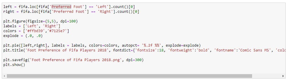
Using the same Fifa data_set.. I first of all check for the amount of player that Preferred Left Foot and Player than Preferred Right Using the loc[] Function from Pandas.
loc[] = index using labels and column based
plt.figure() = resize the chart graph
label() = label the pie part chart
color() = Add color
explode() = To explode the pie chart into different chunks and add space to it, this methos was'nt used in this pie chart
plt.pie() = is the plot syntax for pie chart where the data are placed an other attribute are placed like color, autopct, explode
autopct() = autopct means auto pecentage, this will autopct your pie chart using the given data, % .2f %%, .2f means .2 figure after the decimal, %% means add extra % at the end of your value
plt.title() attribute contain the text lable for your title of your chart, with fontdict={} edit the xlabel font style,size,color,weight etc...
plt.show() Show your Chart (PieChart)
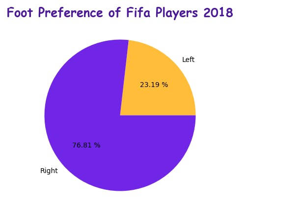
With the help of the pie chart we got a graphical representation that 76.81% of Fifa Player from 2018 Preferred Playing with there Right Foot.
While 23.19% of Fifa Player From 2018 Preferred Playing with there Left Foot.
PermalinkAdavnce Pie Chart
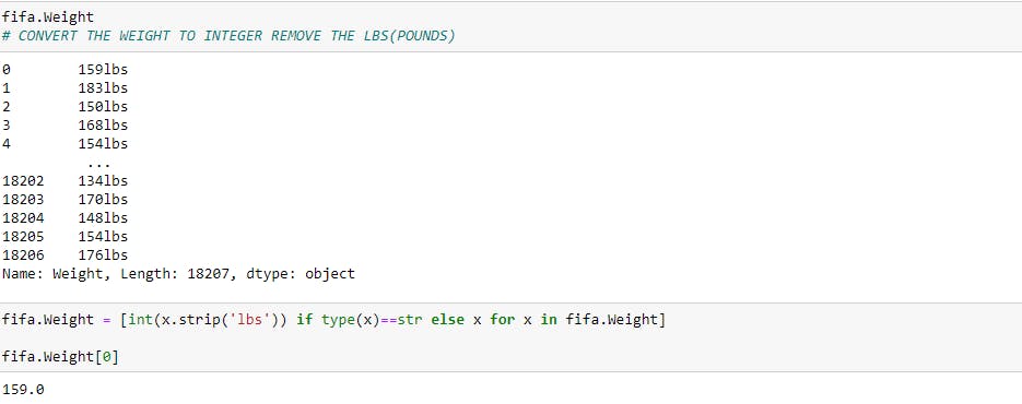
Advance Pie Chart to Show the Weight of Fifa Player
Weight of Fifa Players.
First convert the weight from string to integer value, removing the lbs
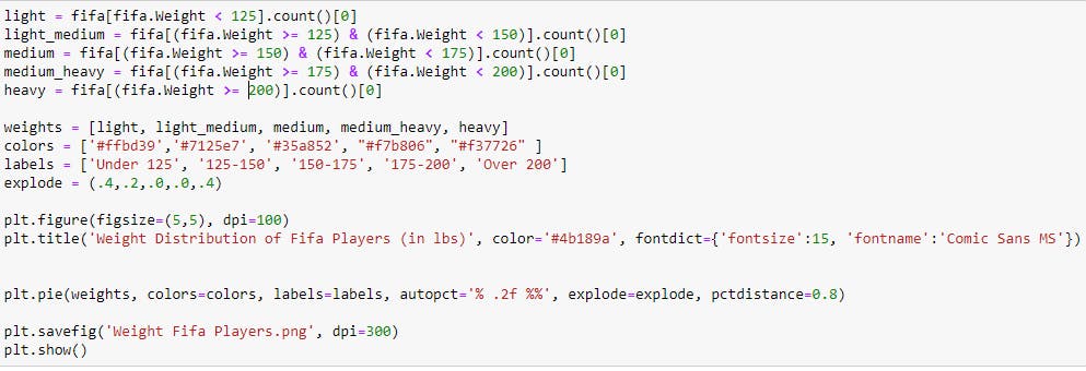
After converting the data we create a Range of Player Weight then pass that to the Weight in the Data to see the Amount of player that are in the Weight range category
Range:
Less Than 125.
Greater Then, Equal to 125 & Less Then 150,
Greater Then, Equal to 150 & Less Then 175
Greater Then, Equal to 175 & Less Then 200
Greater Then, Equal to 200
The . Selection Operator is Created with the Range to sort through the Fifa data_set of column ( Weight ) = Fifa.Weight < 125
The Selection and Range are Stored in Variable of Category of Size (light - heavy)
The Category of Size from light - heavy are store in a list with variable name Weights
explode() = To explode the pie chart into different chunks and add space to it,
plt.pie() = is the plot syntax for pie chart where the data are placed an other attribute are placed like color, autopct, explode
autopct() = autopct means auto pecentage, this will autopct your pie chart using the given data, % .2f %%, .2f means .2 figure after the decimal, %% means add extra % at the end of your value
plt.title() attribute contain the text lable for your title of your chart, with fontdict={} edit the xlabel font style,size,color,weight etc...
plt.savefig(): save your chart to your device
plt.show() Show your Chart (PieChart)
5 corresponding chunk of pie for different range weight for player within given range
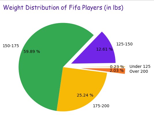
So Far-
Fifa Players that Weight Under 125 is 0.23%
Fifa Players that Weight 125 - 150 is 12.61%
Fifa Players that Weight 150 - 175 is 59.89%
Fifa Players that Weight 175 - 200 is 25.24%
Fifa Players that Weight Over 200 is 2.03%
PermalinkTHE END
Subscribe to our newsletter
Read articles from directly inside your inbox. Subscribe to the newsletter, and don't miss out.

